


What Your Favourite Font Says About You

By Annie Wisbey
During my time at the SCA, my perception on advertising, design and creativity has thoroughly shifted. I now see the world through an Adobe grid and understand more than ever, the symbolic significance of colour in branding and the utter-most importance of strategy.
But, one thing in particular has particularly resonated with me (thank you Mr Ian Hands and Pip), something I simply cannot unsee…
The seriousness of typography and font choice, the shining star of the communications industry.
Typefaces are an imperative element of establishing brand identity and tone of voice. I initially decided to remain unbiased in this blog, however, the sight of Arial gives me cold-shivers. I lay restless at night knowing that this is Google Docs’ default choice of font.
There are 4 main font classifications: Serifs (the little flicky bits on the end of letters), Sans Serifs (without flicky bits), Scripts (cursive, looks like handwriting) and Decorative styles.
Serifs
Examples of Serif fonts include Times New Roman, Garamond and Bodoni. Brands such as Rolex, Zara and Giorgio Armani adopt the traditional and formal style of the Serif font, offering a refined look to logos.
If your favourite font is from the Serif family, you probably shop at Waitrose and own a Le Creuset. You go to Pret or Joe & the Juice frequently for overpriced coffee. You definitely know the difference when the barista uses barista oat milk vs the normal one. You definitely have a subscription to the Guardian and keep your Goodreads account updated daily. Serif fonts scream stability, you’re a reliable person and always on time or 15 minutes early. You enjoy structure and routine, working like clockwork. You still use hotmail.
Sans Serifs
Examples of Sans Serif fonts include: Futura, Helvetica, and Comic Sans, which is apparently the world’s most hated font (along with Papyrus, probably). If you use Comic Sans you must be a primary school student practising their handwriting or be obsessed with the Sims. Serifless fonts are simple and easy to read, creating a clean and cut look. However, they have been horrifically overused, subsequently, lacking salience and adding little to no narrative to brands and communications.
If Sans Serifs are your favourite you are BASIC, so basic that if a Tesco meal deal was your personality it would be a ham sandwich, ready salted crisps and a bottle of water. You probably order lemon and herb at Nando’s accompanied by non-peri peri salted chips and drive a Fiat 500. You definitely know what restaurant Kim Kardashian went to last night and what Love Island couples have recently broken up.
Scripts
Script fonts are swirly and cursive, typically mimicking handwriting. Brands such as Kellogs, Ray Ban, Vimeo and Sharpie use this type of font. Examples of Script fonts include Pacifico, Parisienne and Allura. Script fonts add a vintage and retro flare, as well as personality and elegance to brands. However, be wary of wielding script fonts as they can be illegible when used for large amounts of text.
If fonts from the Script family are your favourites, you most definitely have an Instagram feed aesthetic. You shop vintage, and rinse out eBay for second-hand gems, revelling in the fact that no one else will be able to replicate your outfit. You probably own a rainbow collection of berets and an insane record collection. You subscribe to Mubi and judge people on their choice of favourite film.
Decorative
Decorative fonts also known as ornamental or display fonts, are characterised by embellishments, offering uniqueness and customised looks to brands. Examples of decorative fonts include Cooper Black. Decorative fonts have lots of flavour but legibility suffers, so it is not ideal for copy.
If Decorative fonts are your favourite you colour coordinate emails and your Google Drive and absolutely rinse out Pinterest, having at least 450 boards. You listen to David Bowie repeatedly and binge watch the Great British Bake Off, but preferred it when Mary Berry was judging and Mel and Sue were presenting.
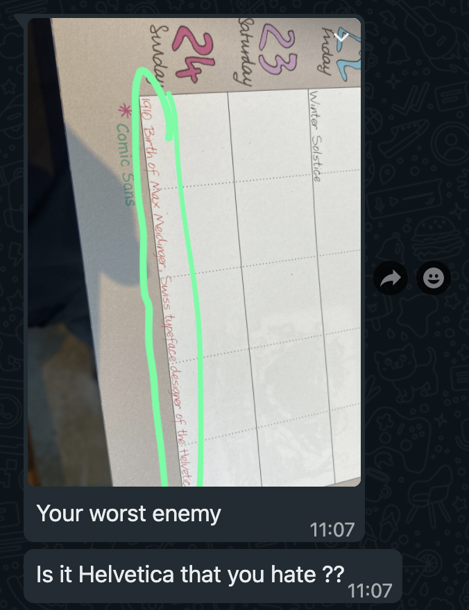
Perhaps I have taken my font opinions a bit too far, it seems to have even rubbed off on my boyfriend, the WhatsApp below serving as inspiration for this blog…


#/media/File:Papyrus_Font.svg)