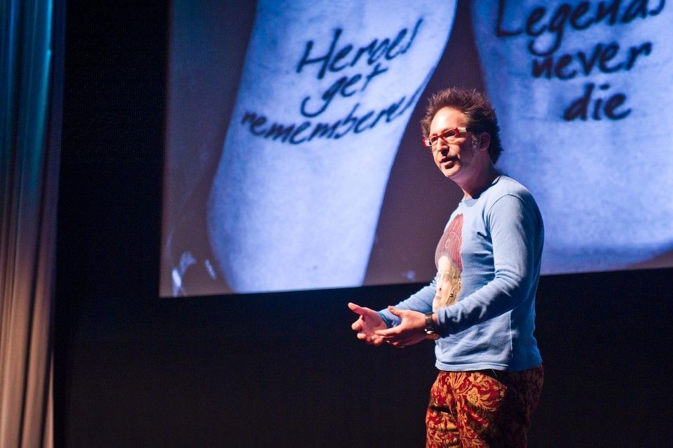
The day Paul Belford came to SCA:
By @teddysouter
The Day Paul Belford Came To SCA
You know when someone hypes up something and you go in to it with big expectations, but then it can’t possibly live up to expectations?
Well this was nothing like that.
Belford came to SCA and was even cooler than we hoped.
He may look like a pissed off Easter Island statue but… he’s the greatest designer in the world. And as it turns out a really friendly guy who just wants everybody to do beautiful work.
Paul gave his masterclass a couple of days ago, and it rocked. I basically have a transcript of the whole thing, which wasn’t intentional. I was just writing down everything that I thought was interesting. However I don’t think he would like to me recite everything he said, so I thought I would break it down to a few points.
Make space for yourself.
This was what Paul said when talking about why so much of his art direction uses lots of white space. His poster for the Tate is a prime example of this. (Apologies for the crude screen shot). He said that he always wanted to try and make some space and time for his ads in a world where advertising is forced in our faces. I loved that, and for me as an aspiring writer it kind of represented how silence is used in dialogue. What’s being said is as important as what isn’t being said. Less is more is the cliche. But Paul makes it brand new and meaningful.
Try strange techniques.
Some of the Art Direction techniques that Paul has used outside of the computer amazed me. He told us about how, for his drink aware ads, he had put a fish bowl on top of the print ad in order to gain a “drunk” and slurred effect, then shot it on camera. I’m pretty sure everyone in the room would agree that this was a far better and more authentic way of creating such an effect, as opposed to trying to mac it up on photoshop. It opened my eyes, certainly, to all the possibilities that can be found outside of adobe.
An ad shouldn’t look like an ad.
One of the more rock’n’roll lines we’ve heard at SCA. The message was awesome. Paul didn’t want his ads to be the best in a magazine. He wanted his ads to be the best page in the damn magazine. People don’t want to look at the same tripe all the time, they want to see something that shocks them in it’s originality and captivates them. As an example of this I thought I’d put in his Shred-it prints. They just don’t feel like your normal print ad, and are far more interesting too.
Show Up.
I just thought this was really cool. Anna asked him what it was that kept him motivated and urged him to carry on, to which Paul replied that he wasn’t sure how to answer. Moments later though he remembered something he’d heard a couple of days before. “Show Up”. If there is something interesting happening, show up, if you’ve said you’ll be somewhere, show up, if a brief is up for grabs…show up.
I’m really glad that Paul Belford showed up.


