Legibility = more friends?!

By Imi Knight
Keep your reader reading. You’re reading this, so that’s a good start… but how could you possibly keep reading this SCAB now that you’ve started?
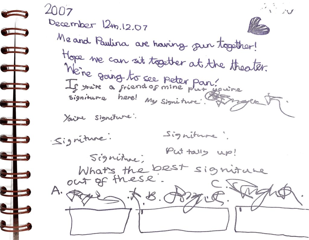
Can you make any sense of this? Or do you even care to read it?
Nor could I initially. The main thing that makes sense is the fact that I had to resort to forging ‘signitures’ for my ‘friends.’ Because I didn’t have any. Because it appears I couldn’t communicate let alone socially interact properly. On the plus side, at least seven-year-old me didn’t type this stuff up in Futura, Helvetica or, forgive my French, Arial.
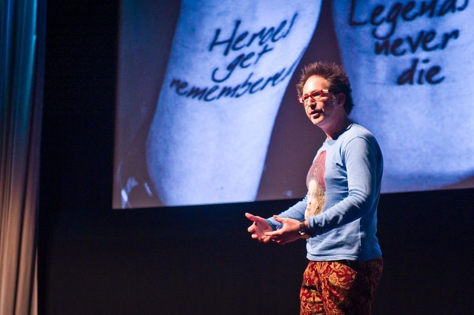
Re-imagining this in the context of Ian’s Legibility Workshop #1… what sins could I be committing now, in the serious world of advertising, which seven-year-old Imo could get away with deep in the confines of her diary?
According to Andy Maslen in his book ‘Persuasive Copywriting’, I should write this SCAB now with the awareness that you as the reader:
1. Are not an idiot
2. Are under no compulsion to read this SCAB
3. Have other things to be doing aside from reading this SCAB
4. Have other things that matter to you more than reading my SCAB
Fair enough, really.
How can I make you stay here to read on a little longer? Steven Pressfield would suggest:
1. Streamlining the message
2. Expressing the message in a fun or sexy or interesting or scary or informative way. Compelling enough that a person would be crazy NOT to read it
3. Applying that expression throughout to all forms of writing or art or commerce
4. Making sure that nothing hinders the readability of your copy (typeface crucial)
Ok, I’ll make this SCAB short. I’ll speak to you as though you were my friend at the pub, and, as far as SCABs permit me, I will lay this out in clear terms.
Legibility is a function of typeface design and is the measure of how easy it is to distinguish letters from one another. Legibility is not to be confused with readability which is dependent on how the typeface is used. Though legibility and readability do operate together, they are not necessarily the same. All things considered, both legibility and readability are crucial to your expression of the idea and how easily transmitted the message ends up being.
Imagine I typed up this SCAB like this TBWA campaign for (it’s wordy) The National Center for Problems of Healthy Lifestyle Development.
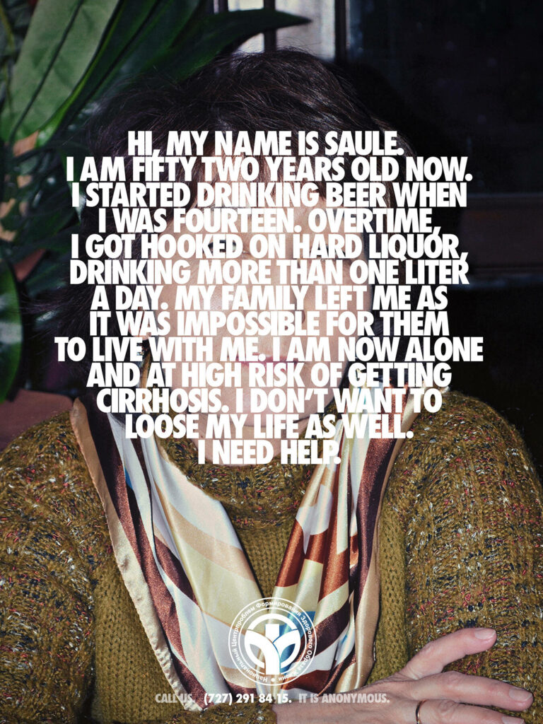
As Ian frequently notes, Futura is severely overused and is heavily associated with Nike. As Ian signalled throughout the workshop and beyond, through the sacred typographic checklist, this TBWA campaign embodies so many of the cardinal sins of legibility: bigger not being better, lack of leading and paragraph breaks, and using an overused typeface. At best, the typography here does tick off Pressfield’s second and third points; it feeds into the narrative of the anonymous subject. But in legibility? Totally lacking. There is nothing particularly compelling about this mammoth unit of text. Saule’s plea is lost to illegibility. Maslen would not be impressed.
Long story short, legibility is vital to the communication of the idea. The TBWA campaign serves as a prime example of a potentially powerful voice being lost to lack of legibility.
Ian’s workshop was a wake-up call for me and my inner seven-year-old child. Legibility will make or break your overall message. Legibility will rally supporters to your cause, so you don’t have to fake ‘signitures’ for your ‘friends.’ Legibility will make your idea sing.
Thanks for reading this far, unless you’ve just skipped here. Hopefully it means I have done something right.