“You say it best, when you say nothing at all”
By Alex, Imi & Richard
God bless Ronan Keating.
With our daily bombardment of visual stimulus, an arresting image with a visual riddle (a.k.a. the promise of a dopamine reward), is the perfect bait to snare our attention. It can leave us feeling clever, and with more respect for the brand.
The caveat dear Ronan failed to mention though, was about how good you need to be at saying things, when you’re not saying things. Ergo, if visual metaphors aren’t your thang, best stick to copy. The rest of you, follow me:
These words uttered by my hero, Rob McGillivray, on day 1 of SCA, have formed part of a mantra that I chant on a daily basis: ‘Keep It Simple Stupid’. However, the ‘Less is more’ motto, coined by architect Ludwig Mies van der Rohe, is perhaps more helpful when pairing back what’s really needed in a visual ad.
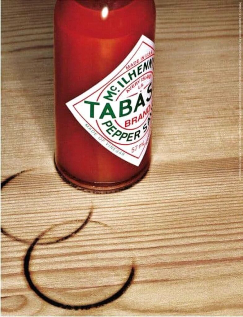
As contradictory as it sounds, simple creative ideas require much more cognitive ability to create than most complicated graphic designs. Done well, simple visual advertising is capable of conveying so much more, but I am still undecided whether this medium is reserved for the most famous of brands. For example, in this ad by Stella Artois, if we removed the words, ‘Reassuringly Expensive’, anyone over the age of 25 would probably still get it – the sheer weight of their preceding campaigns has laid the groundwork. This is earned brand awareness. But if we took away the copy AND the branding on the bottle top, is it just vandalism at a Travelodge?

So, I’ve put together my 10 top tips to create a visual masterpiece. Please credit me for your awards:
1. Strong imagery:
Use high-quality, visually striking images that instantly grab attention.
Choose visuals that evoke emotion or tell a story related to your product or brand.
2. Colour psychology:
Understand the psychological impact of colors and use them strategically.
Create a cohesive colour scheme that aligns with your brand and conveys the desired message.
3. Minimalism:
Embrace minimalism to focus on key visuals and avoid clutter.
Simplify your design to communicate a clear and concise message.
4. Symbolism:
Incorporate symbols or icons that represent your brand or product.
Utilise universally recognised symbols to convey concepts without the need for text.
5. Whitespace:
Allow for ample whitespace to enhance visual clarity.
Use negative space to guide the viewer’s attention and create a clean, modern look.
6. Branding elements:
Ensure your brand logo is prominently featured.
Use consistent brand colors and imagery across all visuals.
7. Asymmetry and balance:
Experiment with asymmetrical designs to create visual interest.
Balance elements strategically to maintain a pleasing composition.
8. Product in action:
Display your product or service in action through imagery.
9. Visual puzzles:
Create visually intriguing puzzles or patterns that prompt viewers to spend more time engaging with your ad.
10. Contextual imagery:
Use imagery that is contextually relevant to your target audience.
Ensure your visuals resonate with the emotions or experiences of your potential customers.
Et voila. SImples…
Remember, the key is to capture attention, convey your message, and leave a lasting impression, so find the human truth of your product and start riddling.
In the words of David Abbott, “Sometimes the best copy is no copy”.