


60 Seconds on Semiotics
By Annie Wisbey
So this blog will probably take you a bit longer than 60 seconds but hey-ho. At SCA, this week has been all about semiotics. So I thought why not write a cheeky little number to consolidate what I have learned? But I’ve gotta be honest, I am not the one to explain the theory of semiotics, so you better check out the work of Chris Arning and Uri Baruchin. I will, however, give it a good go.
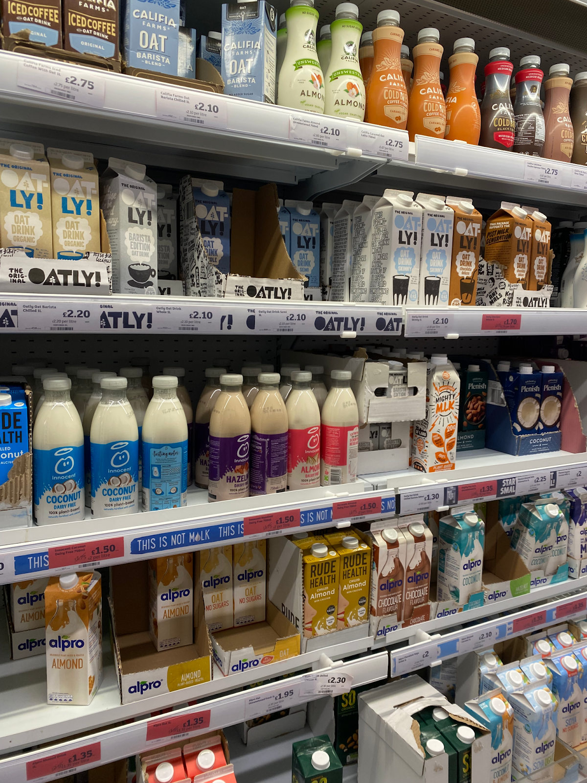
In the UK alone, we are exposed to over 5,000 messages daily. There is soooooooo much shit out there. I mean take a look at the chilled oat milk section in Sainsbury’s alone
Brands utilise the power of semiotics to distinguish themselves. But what actually is semiotics?
At its most basic form, semiotics is the study of signs. It’s how we interpret, analyse and make sense of everything around us. But, how do you define a sign?!
A sign can be anything (helpful I know…). It’s not just symbols, but also colours, sounds, camera angles, patterns and typography. A sign is anything we infer meaning from; highlighting how every pixel has the uttermost importance in the art of communication.
Signs create meaning and are broken down into the denotation (the literal meaning) and connotation (the signified meaning).
Here’s an example.
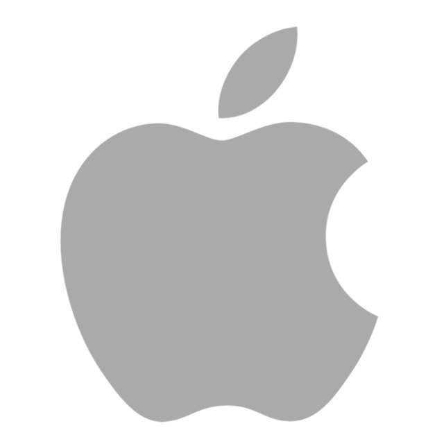
So what is this? It’s the Apple logo. That’s the denotation. A sign’s most basic meaning. The connotation or, signified meaning is created from our socio-cultural and personal associations. For example, in my brain, I associate this logo with technology, Silicon Valley, really annoying software updates and also forced Chinese labour. The reason for different interpretations is that signs are polysemic, meaning they have multiple meanings.
Right, so now we have a basic understanding of semiotics, let’s have some fun, picking apart the Conservative party logo.
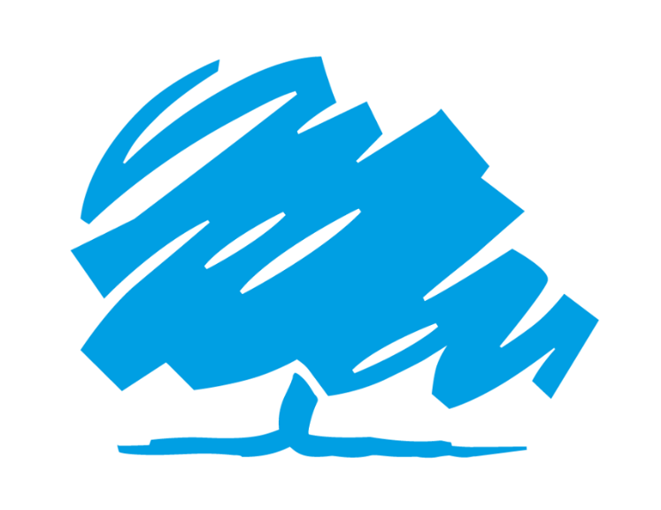
Semiotics aside, this logo looks like the remnants of my £2 scratch card or perhaps a drawing from my 6-year-old cousin (I reckon she could have done a better job actually).
Right, so the denotation, in its basic form it’s the Conservative party logo. Connotations of this in my mind are BLOO passport, vegaan sausage rolls and a very wet lettuce (no don’t be silly, not Rishi Sunak, but a literal wet lettuce). Oh, and also connotations of greed, corruption and dishonesty.
Okay, let’s break down this logo a bit more. Despite this logo looking like a drawing I’ve done with my left hand (I am right-handed and not ambidextrous), this squiggle is actually a tree.
Symbolically, trees have connotations of life and growth. Taking a closer look at the type of tree, it’s oak, which isn’t only the national tree of England but also has connotations of endurance, stability and strength (how ironic). The shade of blue has also been chosen strategically, being a few shades lighter than previous logos to appear less threatening and innocent perhaps. Blue is typically used in branding to evoke feelings of trust and reliability, which is why it’s a popular choice amongst healthcare (we see you NHS), banks and corporate companies.
Ultimately, Semiotics is all about seeing through the Matrix, it’s seeing what others can’t and it goes hand in hand with creativity. Or perhaps my semiotic analysis of the Tory logo is all bollocks and they just really like that shade of blue and children’s drawings.


