‘Lights, Camera, Action!’
By Kyle Young
How Photography Can Improve the Ads.
‘The point of this talk is about improving our work’
‘Can it be better?’ Alan Burles started his masterclass on Photography in Advertising with a thought many of us had been thinking, as we looked to get ideas ready for our next WIP meeting, two days back after Easter break. It also helped that we had just had another masterclass with Ian on organizing thoughts and making things look better.
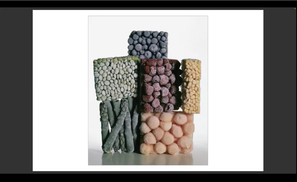
Campbell’s Soup and Harrods
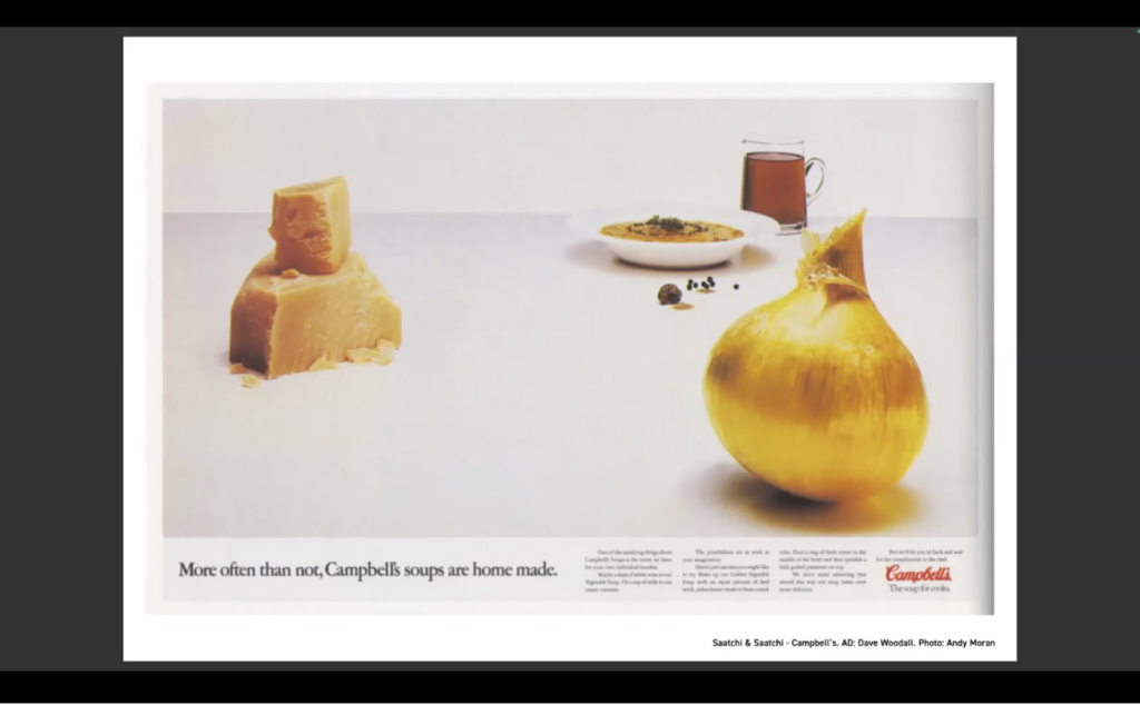
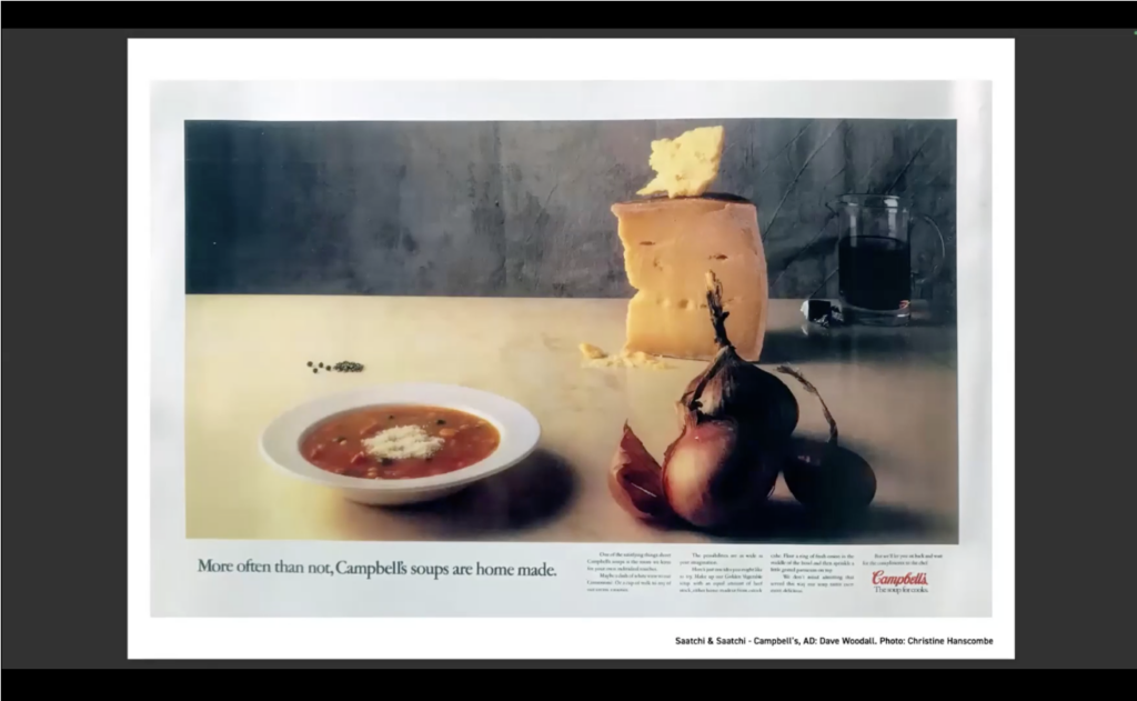
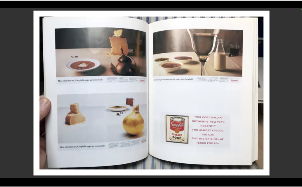
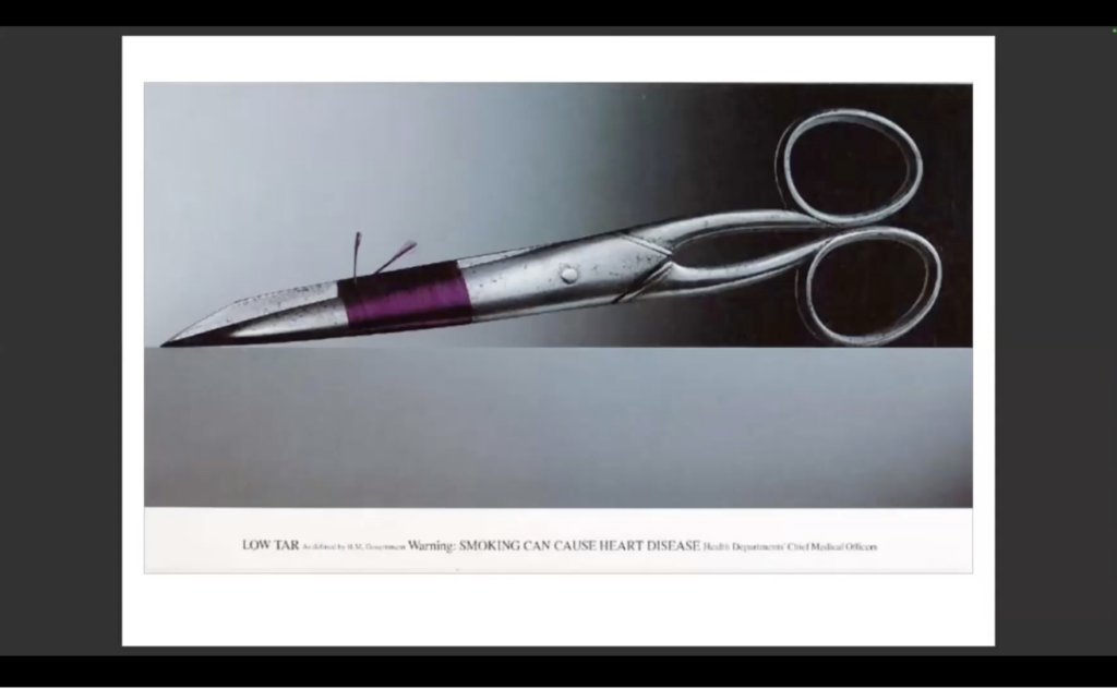
Alan then gave us examples given to him by friends from the industry: ‘Good, Better, Best’ Examples of photography in ads that show the progression of the image (and therefore the idea) in this order. The first one from Dave Woodall displayed ingredients for a Campbell’s Cheese and Onion soup in a picture which took two weeks to set up, then after a Creative Director asked ‘is this the best it can be?’, they hired a new photographer Kristine Hanscombe, who specialized in editorial photography, to do the re-shoots. Straight away she championed the soup and ingredients and immediately made it better.
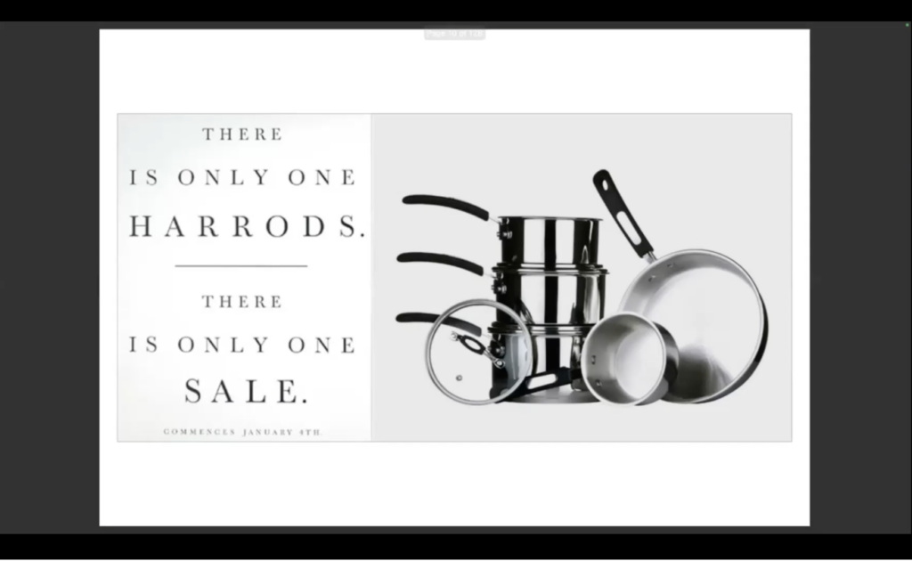
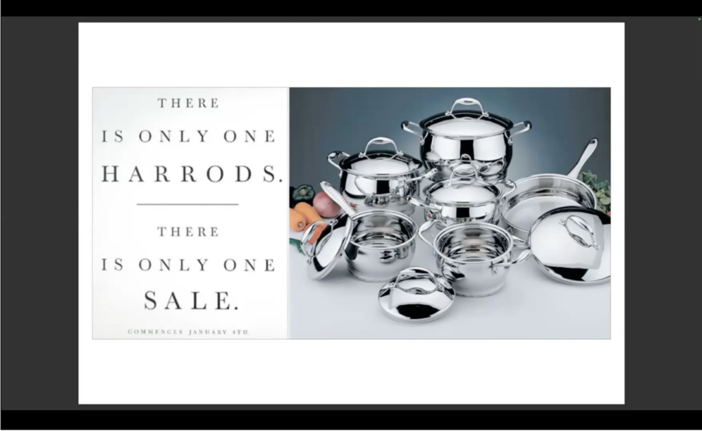
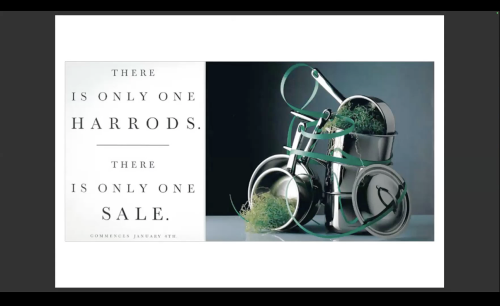
Next was an experimental ad for Harrods’ one and only sale, Art Directed originally by Steve Dunn at Leagas Delaney, where Alan swapped out the imagery with photos he chose; Saucepans, Cutlery and Wine. ‘Good’ will get the job done, he says ‘we are a shop that sells pots and pans’. ‘Better’ will show the viewer that you are a slightly more expensive shop like John Lewis, with a better layout and lighting. ’Best’ has to be that, the best pots and pans shown in the best light by the best photographer (think working in Paris, on Vogue Italia), the artwork shown was like a piece of art, a sculpture made up of pots and ribbon, beautiful, and oozing class. Very Harrods.
Homebase
It took me back to when I worked at Homebase whilst I was at University, where we were trained to show customers to the products that they were after, then if they asked for help or advice, to show them the ‘Good, Better, and Best’ items that suited them. We could never say cheap or budget, in case that was the one that the customer wanted, but it was ‘Good’ enough for the job. ‘Better’ because it was slightly more expensive but a recognizable brand, and ‘Best’ was the one that was highest in price but perhaps offered the most value for the customer.
Takeaways
This felt like a useful metaphor for using creators (i.e photographers, illustrators, animators etc) in advertising — when a most basic image may not get the best way to sell the idea across, then thinking ‘How can it be improved?’ like finding those who show your product differently, who look at the attention to detail, have a bit more experience or are a bit more higher-end of the budget, should give you better results. This could also mean handing over imagery to Graphic Designer in order to improve the image or make it something new.
Alan, like all other mentors at SCA, advised us to gather the best collection of great photographer names and styles. To get down to small second hand book shops or giant Waterstones stores near Piccadilly Circus and take down lists of names. To seek out the ones who show things differently and with attention to detail, in various categories such as; Portraiture, Landscape, Fashion or Food photographers.
Notable ‘dots’ I collected from today’s session were;
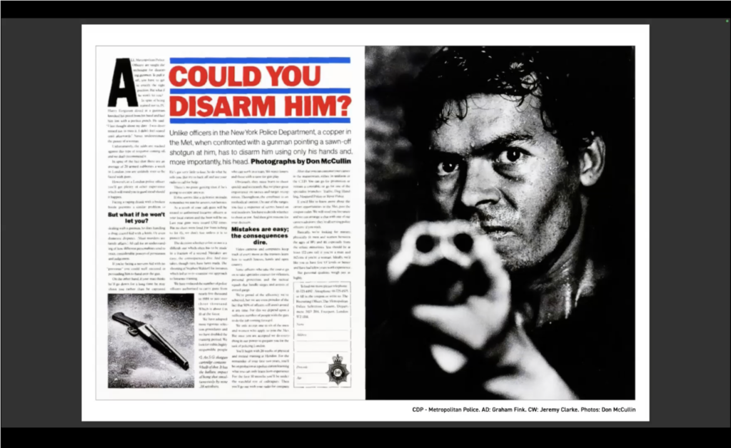
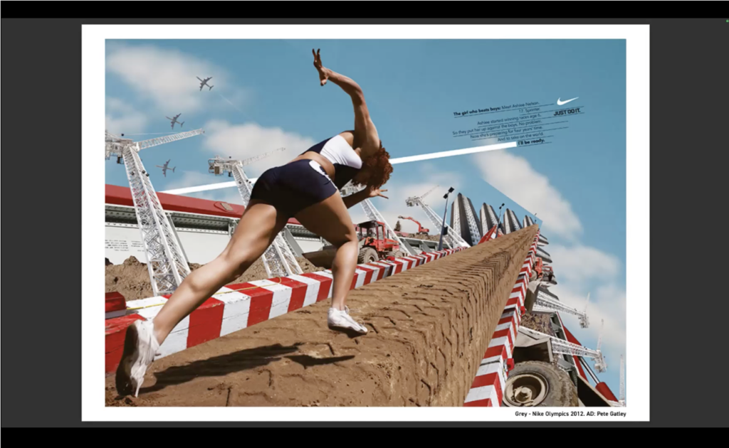
– Art Directors: Dave Woodal, Steve Dunn, Dennis Lewis, Pete Gatley and Graham Fink
– Artists: Francois Gillet and Peter Ruting
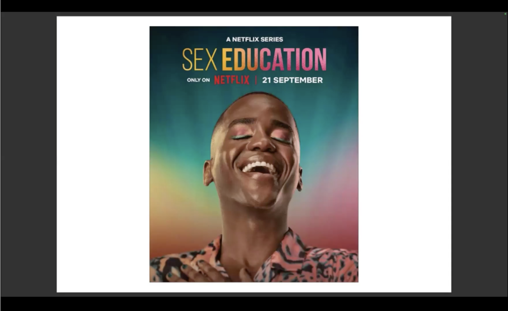
– Photographers: Ellen Von Unwerth, Kristine Hanscombe, Daniel Jouanneau, Rankin, Richard Avedon, René Margritte, Don McCulliin, Boo George, Nadav Kander, Irving Penn, Tom Sloan and of course, Alan Burles.