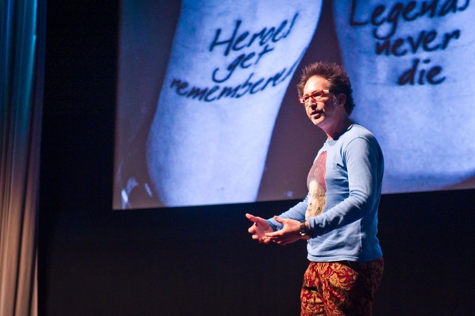
Paul Belford, Art makes you see the world differently @PhilipLeBrun
By Phil Le Brun
Art makes you see the world differently.
This was the proposition behind some of the ads Paul Belford showed us today and I left the studio digesting that thought.
With a portfolio of award-winning work from over twenty years in London’s top agencies and a wealth of personal passion and business projects, today Paul treated us to a masterclass on art direction. Helmut Krone’s principles of creating a ‘new page’ set the tone for the talk as we explored his influence on Paul’s work. Here’s what I learnt and how it made me ‘see the world differently’.
The ads I referred to earlier were part of a campaign for the Tate Gallery and for me encapsulated everything about Paul’s approach.
Firstly they are timeless. Despite being done twenty years ago, their simplicity and charm make them as relevant now as they were then.
They don’t look like ads. The use of white space and closeup photography means they look like mini pieces of art. This is an important thread that weaves through a lot of Paul’s work. The ads reflect and live in the world of their subject and tell a story not just through their copy or image, but the medium itself. From receipts to packaging, to shadows and scanned in objects, Paul’s work has a realness and texture to it I can’t help but be drawn to in an increasingly digitalised industry. A strong lesson for us all, that budgets and software don’t need to be a restraint on craft.
Be irreverent. Take all the elements of an ad and reimagine them in the most interesting way possible. The Economist lightbulb ad Paul shared showed us it is possible to find opportunity even within such a seemingly restrictive format.
Do passion projects. Work for free as an opportunity isn’t always commercial. Helping a friend out with a packaging redesign could win you a pencil and provide a well-needed balance to the monotony of briefs within an agency.
The greatest compositions are created through constant iteration, which can mean late nights of tweaking and even accidents. Add in elements, if you want people to be drawn to certain parts of an ad, don’t be afraid to use boxes or space to obscure the eye. Throughout Paul’s work, typography played much more of a role than just a font. It enhanced the creative and completed the story. Our art direction should aim to surprise people and push for the unexpected.
The Tate ads also showed me the power of conviction and pushing your work. Paul spoke of his heated discussions with the client and their insistence that the image should be larger. The ads wouldn’t be the same without his justification and rationale for every element. We also learnt the importance of painting a picture in order to sell your idea through references and mood boards.
The significance of collecting things has become clearer than ever to me. The Tate ads were born out of a scrapbook of interesting images archived and buried away. It’s crucial to see opportunity and inspiration in the world around us. A cinema poster, a stamp, a piece of street art or a comic book could be the bridge between a blank page and a scribble, a problem and a solution or a good idea and a timeless campaign.


