The curse of the trained eye

By Hannah Underwood
Sat in the basement of the Drum on a chilly Wednesday afternoon we prepared for Ians class on legibility part 2. Little did I realise I would never see the world in the same way. I always had an inkling that something wasn’t right, things felt off but I couldn’t spot why.
I must be coming down with something as my head just can’t focus on the words in front of me. Maybe I need a Lemsip or actually a latte from the over priced cafe down the road. Why are the words so boring? A question I ponder as Ian enlightens the room with a mass sigh of relief, I am not alone. When type is hard to read it becomes a minefield.
Right think. You’re on a first date. You see a trendy, good looking person (art direction). At first you’re hooked, you think this could really be something. But the more time you spend getting to know them they never stop talking about themselves. They have a dull voice and you don’t really get what they’re trying to say. Basically you are bored stiff. The trendy exterior is wearing off and you’re not quite drunk enough to appear entertained. You plan your immediate escape route as you look for the closest exit in your peripheral vision.
You want to keep your reader reading, don’t tire them out.
Training my eye with Ians mentoring I feel life is becoming cursed — but in a good way. I’m in a somewhat horror film seeing widows and orphans everywhere I go. Poor lonely little orphans. I digress. What I really mean is that I can not unsee the curse of bad layout. Widows, orphans, bad tracking, misalignment, illegible text, all cap sentences…the list goes on.
It is all in the rhythm of the writing. Reading an adverts copy should feel like reading music. Being a musician myself I can relate, as learning the flute you need a lot of breath regulation and control. You can’t expect someone to read forever with no break — they will implode. Take care of your reader and they will take the time to read your work. Make it worthwhile. Make is jazzy, but make it make sense.
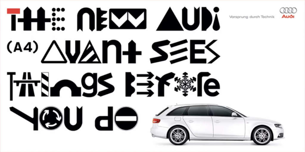
Meanwhile back in the basement of the Drum, there can be a method behind the madness. Ian showed us some great examples where text is made illegible on purpose. Using the frustrations of the viewer to the adverts advantage. Audi’s Vorsprung Durch Technik posters are a great example of this. Here they use road signs in the form of hard to read letter forms to show the reader that the car will spot things before they do.
Ian raised a very fundamental point during his class. Is the advert made to be read or made to be looked at? Get your priorities right. When tracking becomes too loose the words fall apart and become shapes. This can happen also when the tracking is too tight words merge into one shape.
Sometimes the rules are meant to be broken, but only if you know the rules in the first place.